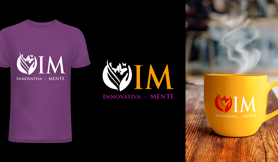
Top
IM Innovativa mente – PAPAV
fade
2971
wp-singular,post-template-default,single,single-post,postid-2971,single-format-standard,wp-theme-flow,wp-child-theme-flow-child,eltd-core-1.2.2,flow child-child-ver-1.0.2,flow-ver-1.8,,eltd-smooth-page-transitions,ajax,eltd-blog-installed,page-template-blog-standard,eltd-header-standard,eltd-fixed-on-scroll,eltd-default-mobile-header,eltd-sticky-up-mobile-header,eltd-dropdown-default,wpb-js-composer js-comp-ver-6.10.0,vc_responsive

IM Innovativa mente

IM Innovativa mente

When I designed the “IM – Innovativa Mente” logo, I wanted it to feel elegant, expressive, and symbolic of personal growth and transformation. The emblem features flowing leaf-like shapes that form a nurturing space, while the butterfly emerging from within represents creativity, freedom, and positive change—key themes behind the brand.

It’s a visual identity that’s both refined and human, designed to inspire and connect—just like the spirit of the brand itself.

The initials “IM” are strong and clean, offering balance to the organic shapes. I used a modern serif font to combine professionalism with personality. The dual-tone color palette—purple for creativity and transformation, and orange for energy and optimism—helps convey a sense of innovation and mindful evolution./vc_column_text]
webart
No Comments

Post a Comment