DTF
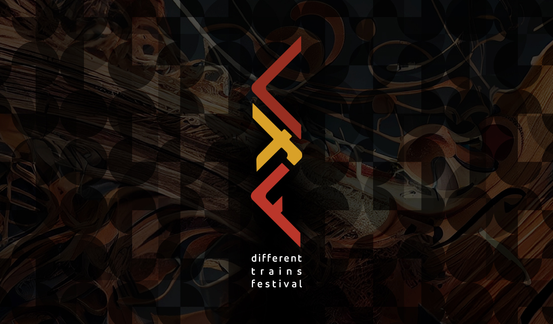
The Different Trains Festival logo stands as a vivid symbol of movement, rhythm, and cultural intersection — a visual composition that reflects the very soul of the festival itself. The bold, angular forms at its core recall the shifting paths of railway tracks, evoking a journey that is both literal and metaphorical, where sound and motion become inseparable companions. These sharp, geometric lines seem to pulse with the energy of music in transit, suggesting both structure and improvisation, discipline and freedom
A dynamic symbol of movement, rhythm, and connection — the logo captures the spirit of travel and sound, where diverse paths and cultures meet in harmony. Its sharp forms and warm colors evoke the energy of music in motion, reflecting the festival’s fusion of tradition and innovation.
The contrast of warm red and yellow hues brings a sense of vitality and creative spark, hinting at the diversity of influences, traditions, and artistic expressions that meet within the festival’s program. The yellow shape at the center acts almost as a crossroads or a point of connection — the place where different artistic ‘trains’ converge, exchange, and transform. Meanwhile, the dark, intricate background — layered with textures of strings, wood, and abstract forms — whispers of classical roots and experimental possibilities, suggesting that this is not just a festival of sound, but of story, history, and human experience.