


AMBEL
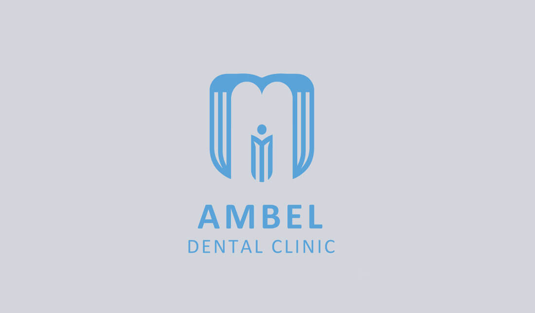
The AMBEL Dental Clinic logo combines modern aesthetics with symbolic meaning to create a professional and welcoming identity. At the center of the design is a stylized emblem that cleverly resembles both a tooth and the letter “M”, subtly reinforcing the clinic’s focus on dental care and the brand name. The vertical elements within the “M” also form a human figure with outstretched arms, representing care, compassion, and the patient-centered approach of the clinic.
Blending care and precision through a modern, tooth-shaped emblem. A symbol of trust, hygiene, and patient-centered excellence.
Rendered in a soft, calming blue, the logo evokes a sense of cleanliness, trust, and tranquility—qualities essential in a healthcare environment. The font used for “AMBEL Dental Clinic” is clean and modern, enhancing the logo’s overall professionalism and clarity.