
POLIS
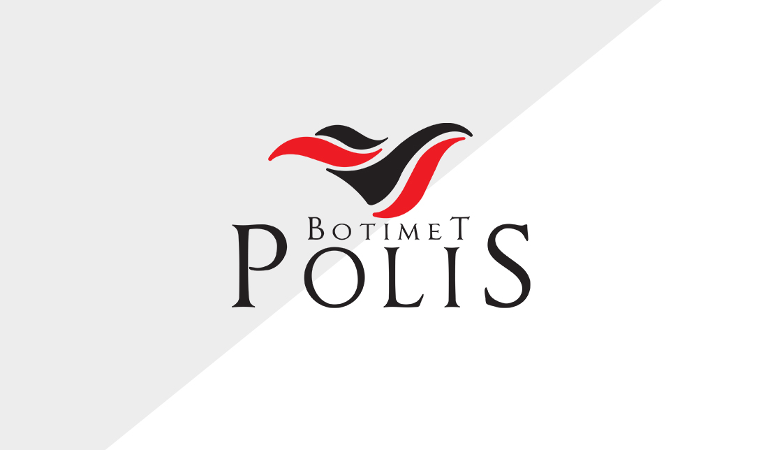
When designing the logo for Botimet POLIS, a publishing house focused on artistic literature and children’s books, I wanted to create a mark that feels both refined and imaginative—just like the books they publish. The flowing symbol above the name takes inspiration from the turning pages of a book, forming an abstract bird in motion. This bird-like form represents freedom, creativity, and the power of stories to take flight. The use of red and black gives the logo contrast and elegance, with the red injecting energy and passion, while black adds a classic, timeless touch.
Typography is the work of typesetters, compositors, typographers, graphic designers, art directors, manga artists, comic book artists, graffiti artists, and now—anyone who arranges words, letters, numbers, and symbols for publication or display.
For the typography, I chose a serif font with character—stylized enough to feel literary and artistic, but still readable and structured. The name “POLIS” is given visual prominence, grounding the identity in strength and clarity, while “Botimet” is treated more delicately, to reflect the careful, thoughtful nature of publishing. Overall, this logo captures the spirit of a publisher that values both intellectual depth and imaginative storytelling, bridging the worlds of adult literature and children’s wonder under one visual identity.