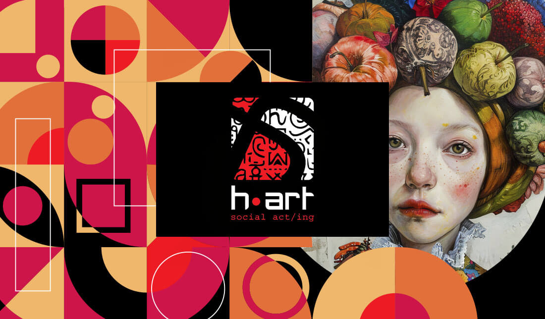
h•art
The logo for this youth social center powerfully conveys creativity, emotion, and community engagement. The name “h•art” is a clever fusion of “heart” and “art,” symbolizing the deep emotional connection that young people often express through artistic means. The red dot replacing the “e” not only emphasizes the word “heart” but also acts as a focal point, to suggest energy, passion, and artistic vibrancy. With a modern typeface and slightly rounded, to make it feel approachable and inclusive, resonating with a youthful and creative audience.
A bold fusion of “heart” and “art,” the h-art logo channels youthful energy, creativity, and community spirit. The abstract “S” and patterned square evoke street culture, diversity, and social connection. Vibrant red accents bring emotional intensity and artistic passion to this modern, inclusive identity.
The shape S represent the word “social” and symbolize society at large. Within square, various tribal and abstract glyphs to create a collage of cultural references to evoke street art, graffiti, and symbolic languages, all of which suggest diversity, heritage, and individual expression—key values for a cultural youth hub. With red and white color scheme used in this area to bring vibrancy and urgency to the design, with detailed patterns inside the square to suggest creativity bubbling beneath a structured surface.