
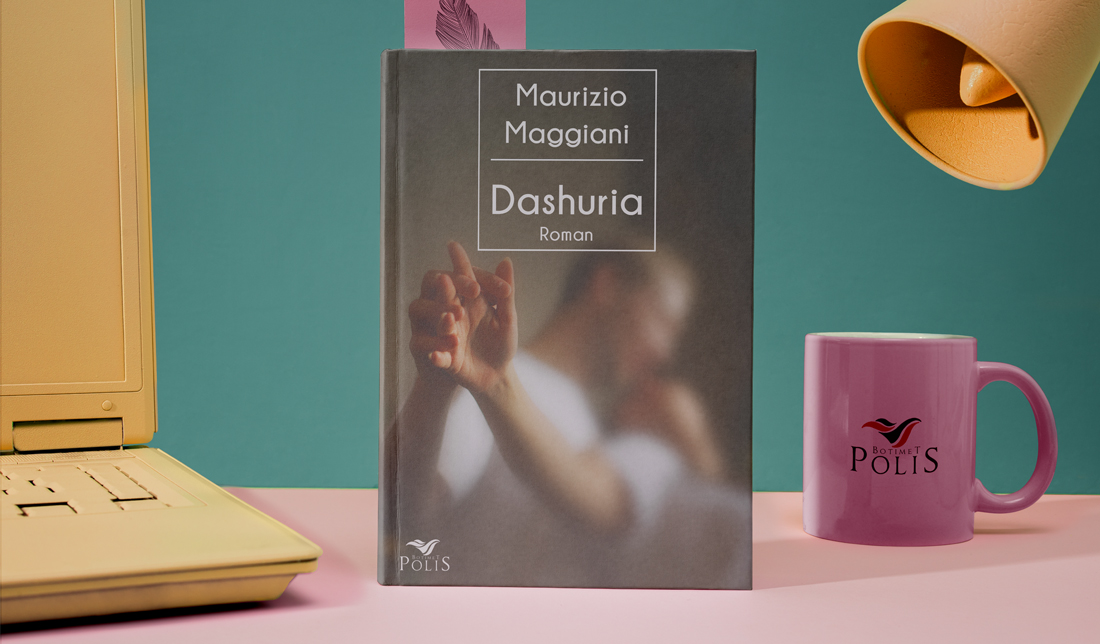
L’AMORE (Alb. Ed.)
When I first read the synopsis of Dashuria (L’amore – Italian Edition), what struck me wasn’t just the romantic theme—it was the subtle, poetic way the story unfolds. It’s a quiet, personal confession from a man who, late in life, has learned to say “I love you” not with fireworks, but with depth, memory, and routine. It’s a love letter to the emotional education we all go through—through past lovers, gentle regrets, and cherished fatterelli (little stories) that shape who we are.
This is not a loud cover—it doesn’t shout. It whispers, like the narrator’s voice in the book. It asks the reader to lean in. And that’s exactly what Dashuria does: it invites us into a lifetime of tenderness, one moment, one memory at a time.
I wanted the cover to reflect that tone—intimate, reflective, and tender. The image of two hands touching, blurred and softly lit, suggests a moment suspended in memory. It’s not a sharp, clear moment, because memory never is. It’s hazy, warm, and emotional. You don’t see faces; you don’t need to. The story isn’t about one specific love—it’s about the act of loving, learning, and remembering.The soft focus and grainy texture help evoke that sense of time passing, of recollection. The composition lets the hands speak—simple, human, and full of quiet connection. For a novel so deeply personal and poetic, I felt the design needed to step back and let the emotion breathe.